
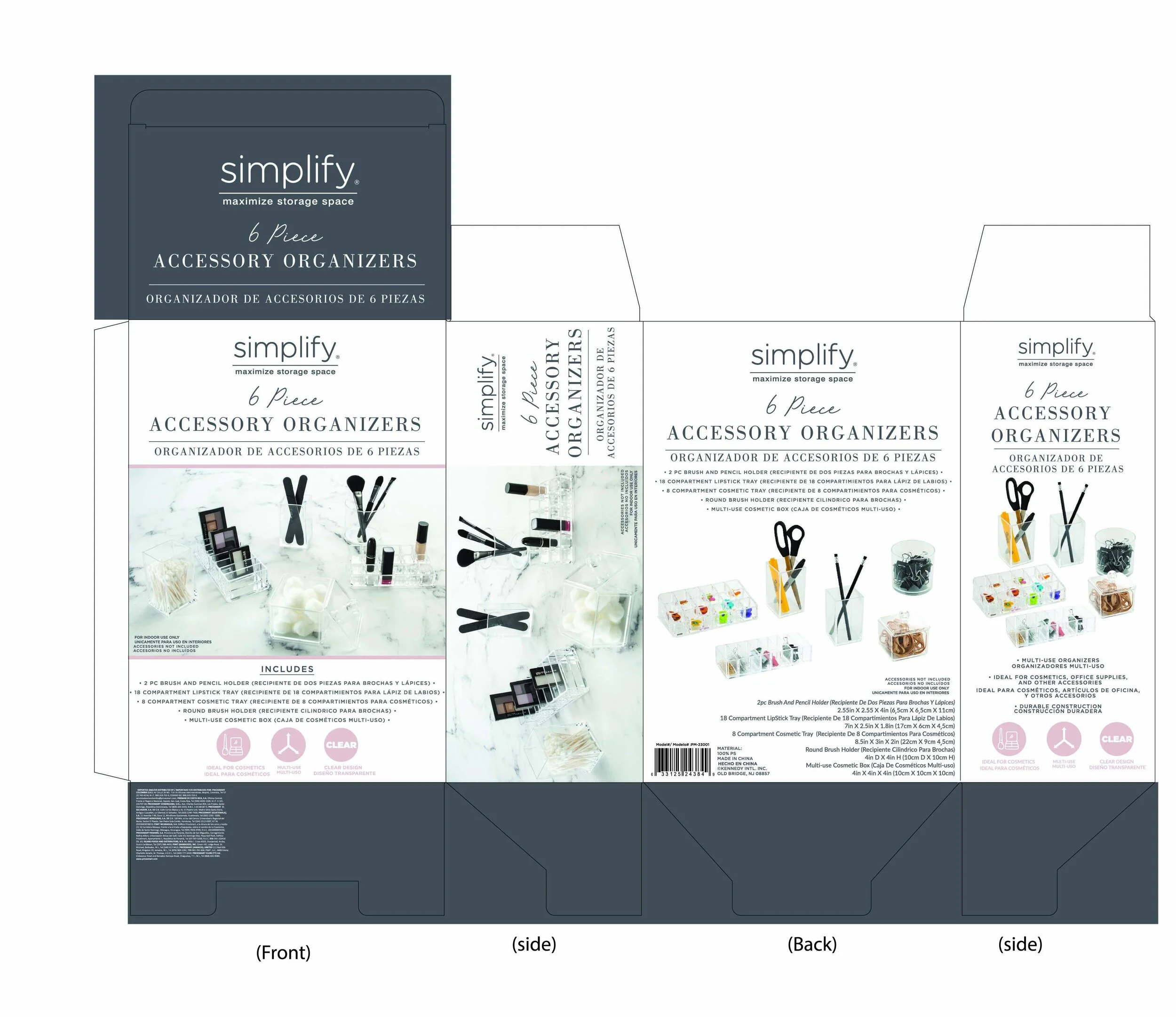
DIELINE
BILINGUAL PACKAGING
For this box, the biggest challenge was creating a simple design that also incorporated both English and Spanish as needed for the customer. It was an incredible amount of information that had to be squeezed down without looking too cluttered. The customer had asked for large photos that showed the product in use in two different ways. This was achieved by incorporating the images on all of the sides, as well as keeping all of the copy simple and organized.
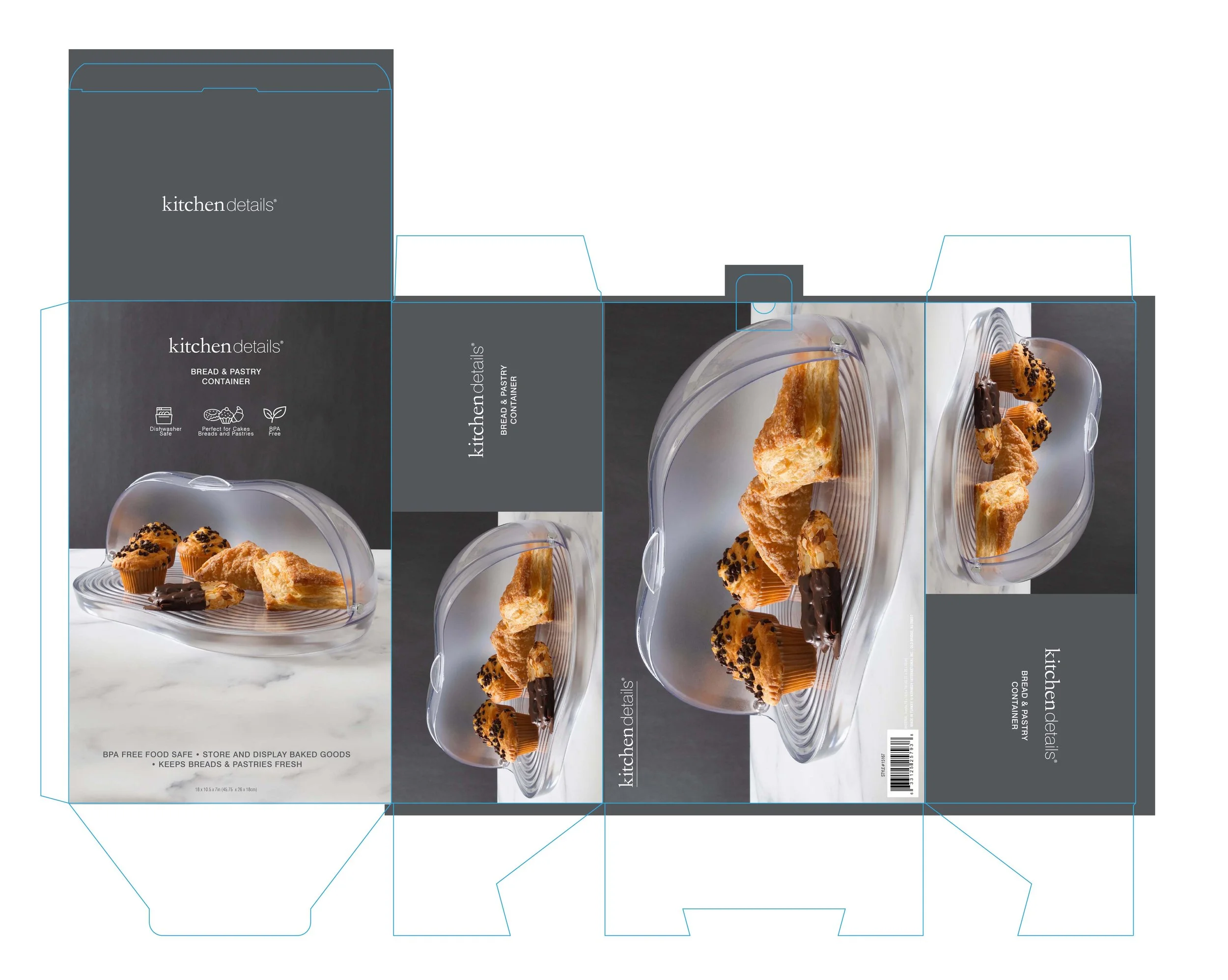
MINIMALIST PACKAGING
This box was designed for a bread and pastry holder. The box would be on a pallet in the middle of a large club store so the photos needed to stand out. The challenge was keeping a minimal design that showcased the item. I used large elevated photos that gave the item a higher perceived value and used line art icons to inform the consumer of the feature in a minimalist way.
DIELINE


DIELINE
CRATE FEEDER
This was actually a very fun package to design. At first it was meant to only have a sticker which had an in use photo so that the consumer could understand how the product would fit to their pets crate, as well Icons and other information along with a UPC. However, I was later informed that the item needed to be peggable. I constructed a header card that used the mechanism on the feeder that holds the bowl onto the gates of the crate. It was a clever fix and makes the item look more unique.


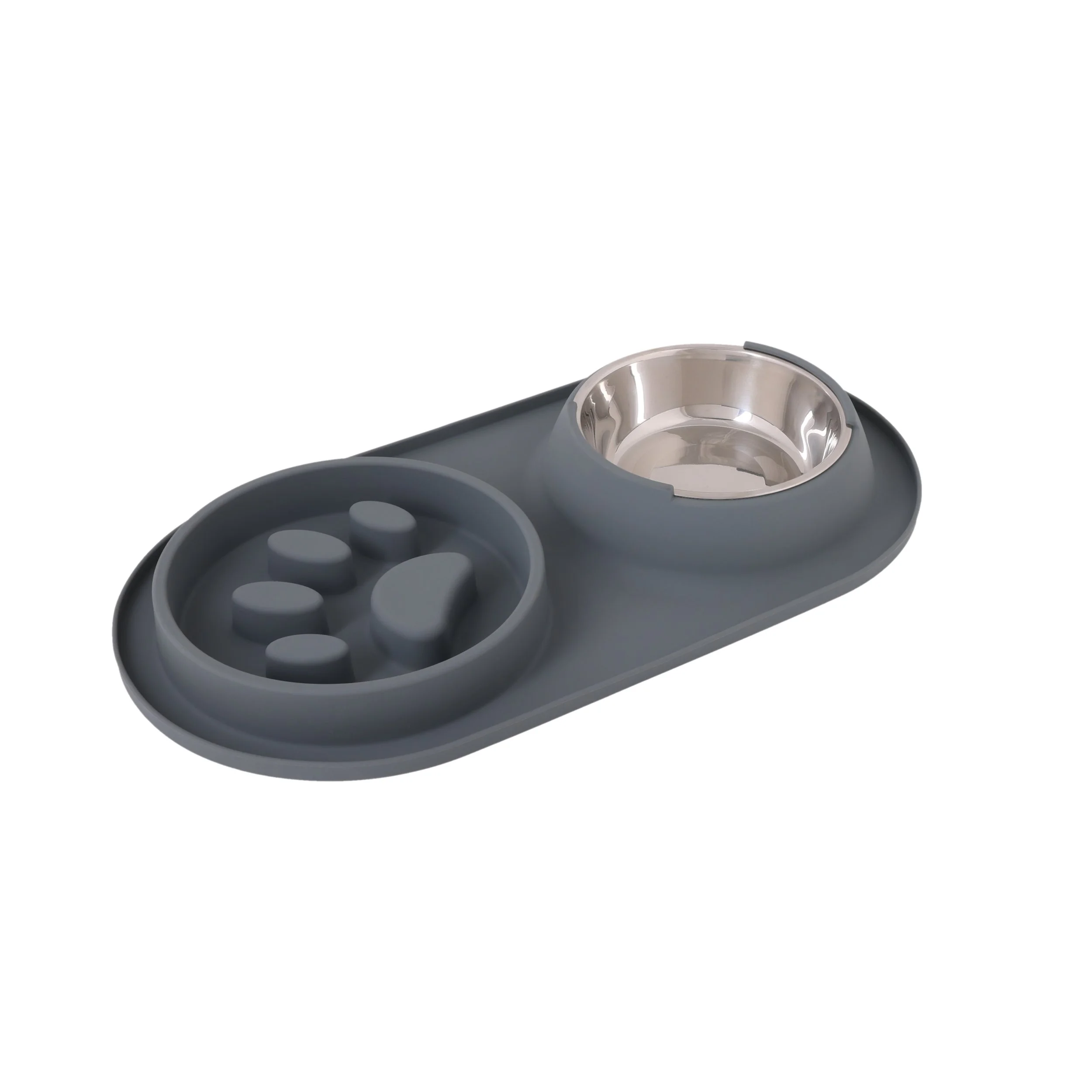
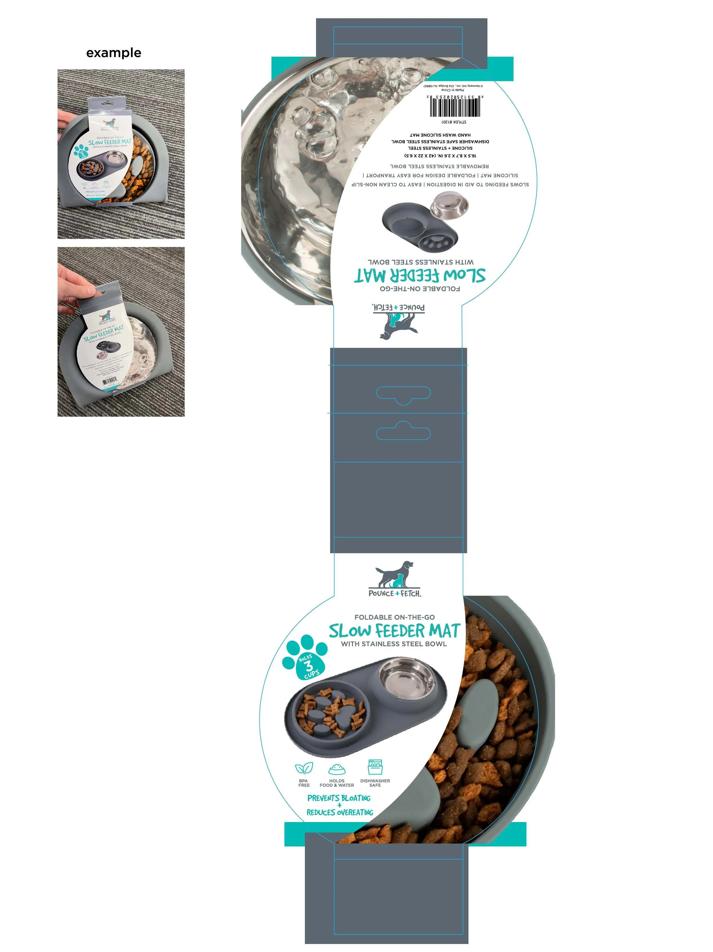
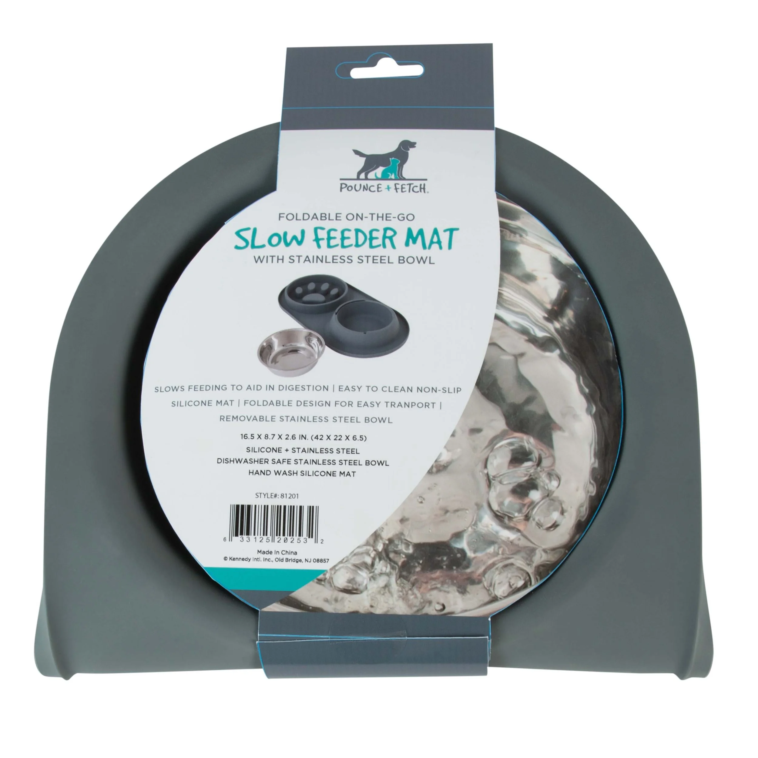
SLOWFEEDER DOG MAT
This was a very unique product to package. The product itself is a pet food mat with a metal bowl for water and a slow feeding bowl that can fold in on itself, making it easy to carry and store. The challenge was that the product would be sold folded so I needed consumers to understand what they were getting by showing off all the functions. The belly band that I created showcased the use of both bowls on either side of the packaging, I split the space in the center of each side to show the mate open as well as each bowl in use. I had a great time working with our in-house photographers to get the bubbles in the water bowl image just right.
DIELINE

DIELINE
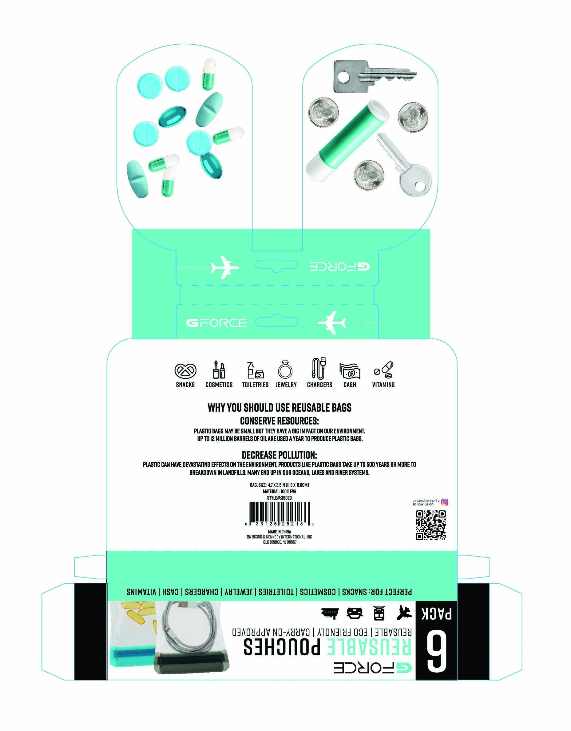
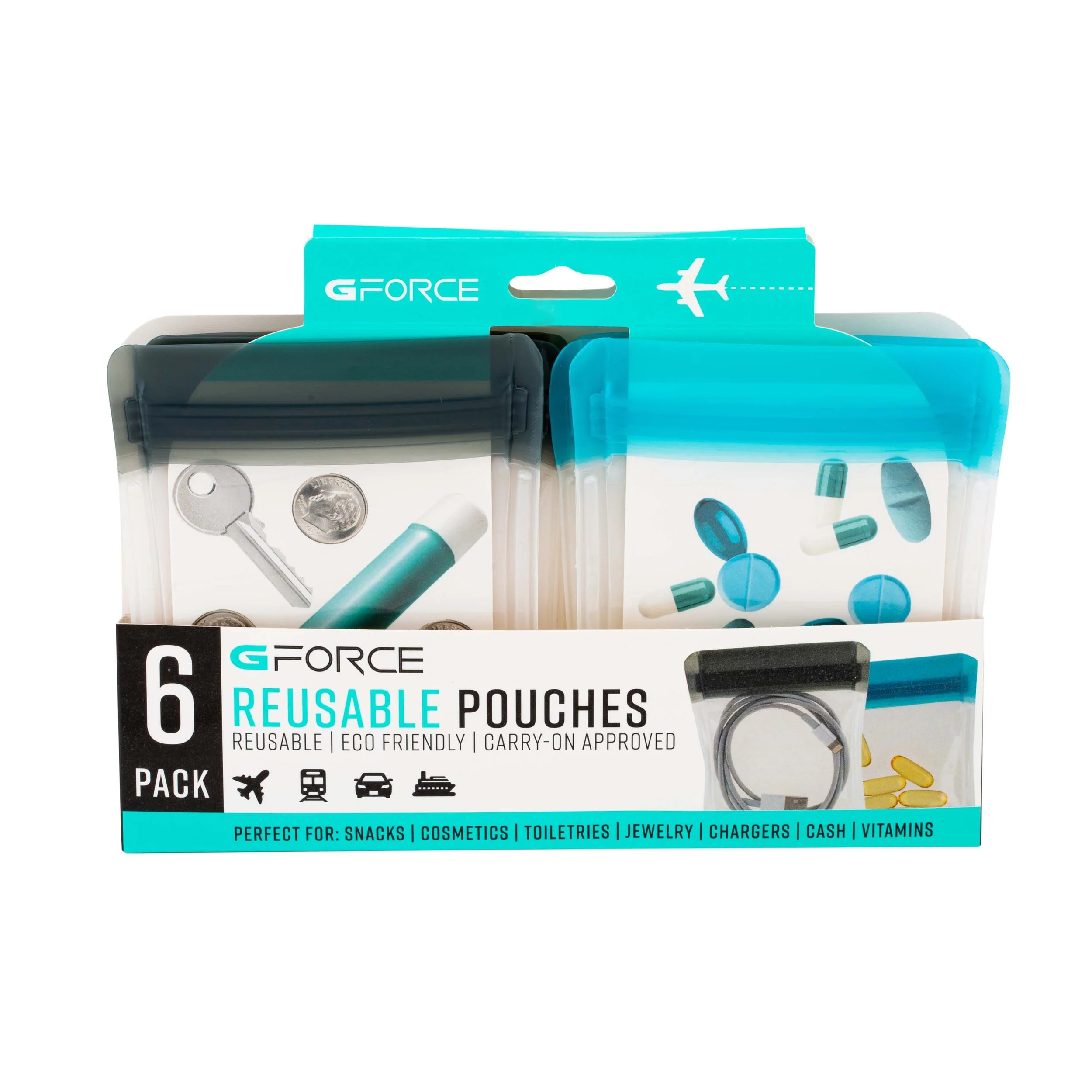
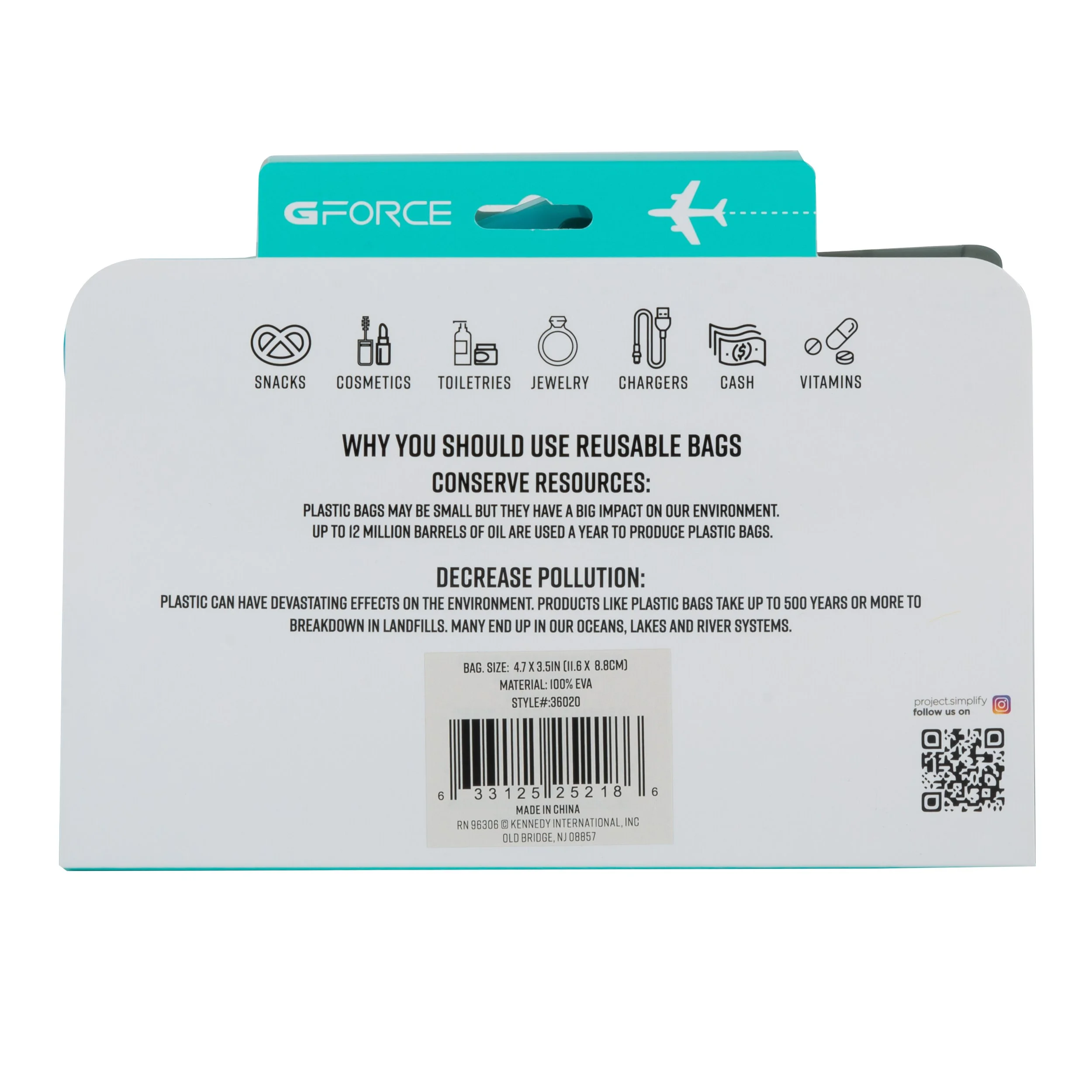
REUSABLE POUCHES
I had an absolute blast creating this entire package. I made the dielines from scratch using inspiration from packaging that I had seen at a Target. The package utilizes two inserts that fold over and slide into the first two bags, the other four bags are neatly tucked in securely behind them. The biggest challenge was to get the exact size of the inserts to be correct. There was a lot of trial and error involved in the dieline alone but overall the package came out perfect.
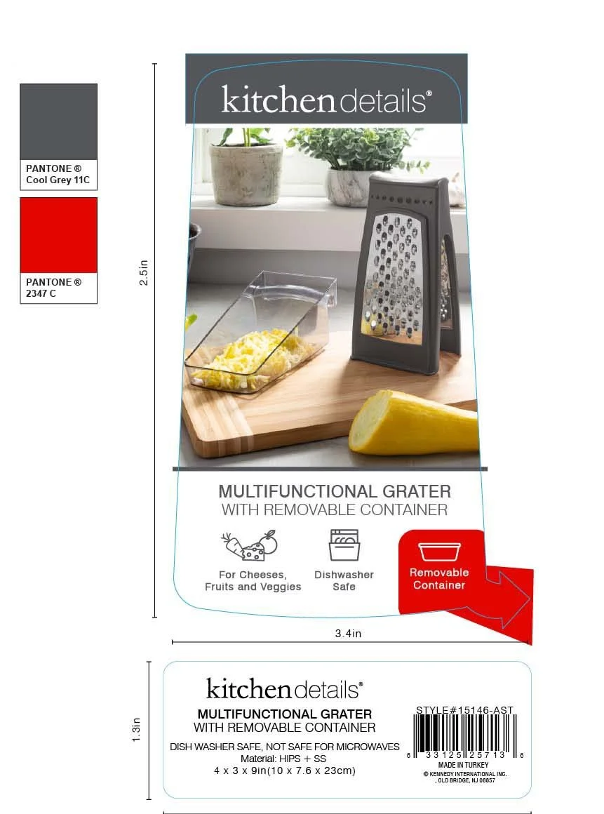
KITCHEN GRATER
For this packaging I had to create a sticker that would go over the metal portion of the product. The biggest challenge of this item was making sure that the sticker didn’t rip, especially in transit. I had to ask the factory for a thicker paper stock when they were creating the sticker. The entire package worked out pretty well in the end, but I think the most unique part of this packaging is the small arrow that points to where the built-in container is located. It is a feature that could be overlooked even seeing it in the photo. I made its icon more of a highlight with the red and simple arrow. Keeping the packaging as simple and minimal as the brand called for.
DIELINE


